Journal
5 Details That Make or Break Architectural Interior Photography
The small things that separate competent documentation from imagery that elevates a project.
The distinction between adequate and exceptional interior photography rarely comes down to equipment. It comes down to small decisions the photographer makes, or fails to make, before pressing the shutter. Things that take seconds to address on site but are impossible to fix afterwards.
These five details compound. Get them all right, and the images feel effortless and professional. Miss even one, and the viewer's attention shifts from the design to the flaw.
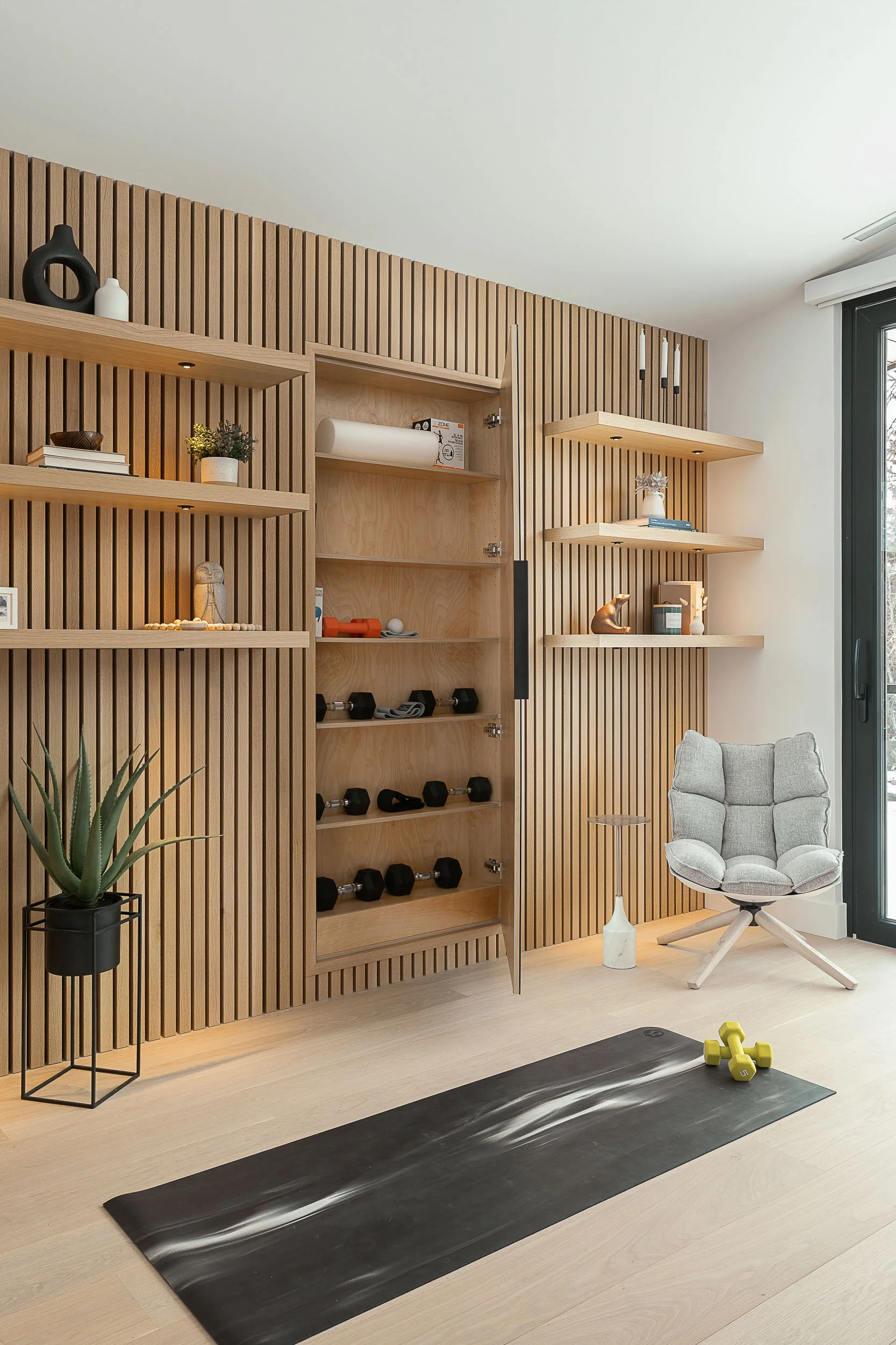
1. Vertical Lines
Every architectural element -- walls, door frames, mullions, cabinet edges -- must read as perfectly vertical in the final image. When verticals lean inward or outward, even slightly, the space appears distorted and unstable. Viewers may not be able to articulate why something feels wrong, but they feel it immediately.
The photographer achieves this through careful camera positioning, tilt-shift lenses, and post-production refinement. The priority is always getting it right in-camera first. Software correction works, but over-correcting in post introduces secondary distortions, particularly at the edges of wide-angle compositions.
Straight verticals are the single clearest indicator of architectural photography competence. If the verticals aren't corrected, everything else in the image is compromised.
2. Colour Temperature Consistency
Custom homes contain multiple light sources operating at different colour temperatures. Pendant fixtures might emit a warm 2700K glow while the daylight through a window reads at 5500K. The human eye adapts seamlessly between these. Cameras do not.
Mixed colour temperatures create visual confusion: warm orange patches from pendant lights conflicting with cool blue zones near windows. The result looks messy and amateurish, even when the space itself is beautifully designed.
The solution is pre-shoot fixture standardisation. Ensuring all bulbs are at a consistent colour temperature, typically 2700K or 3000K, prevents post-production complications that are time-consuming and often imperfect to resolve.
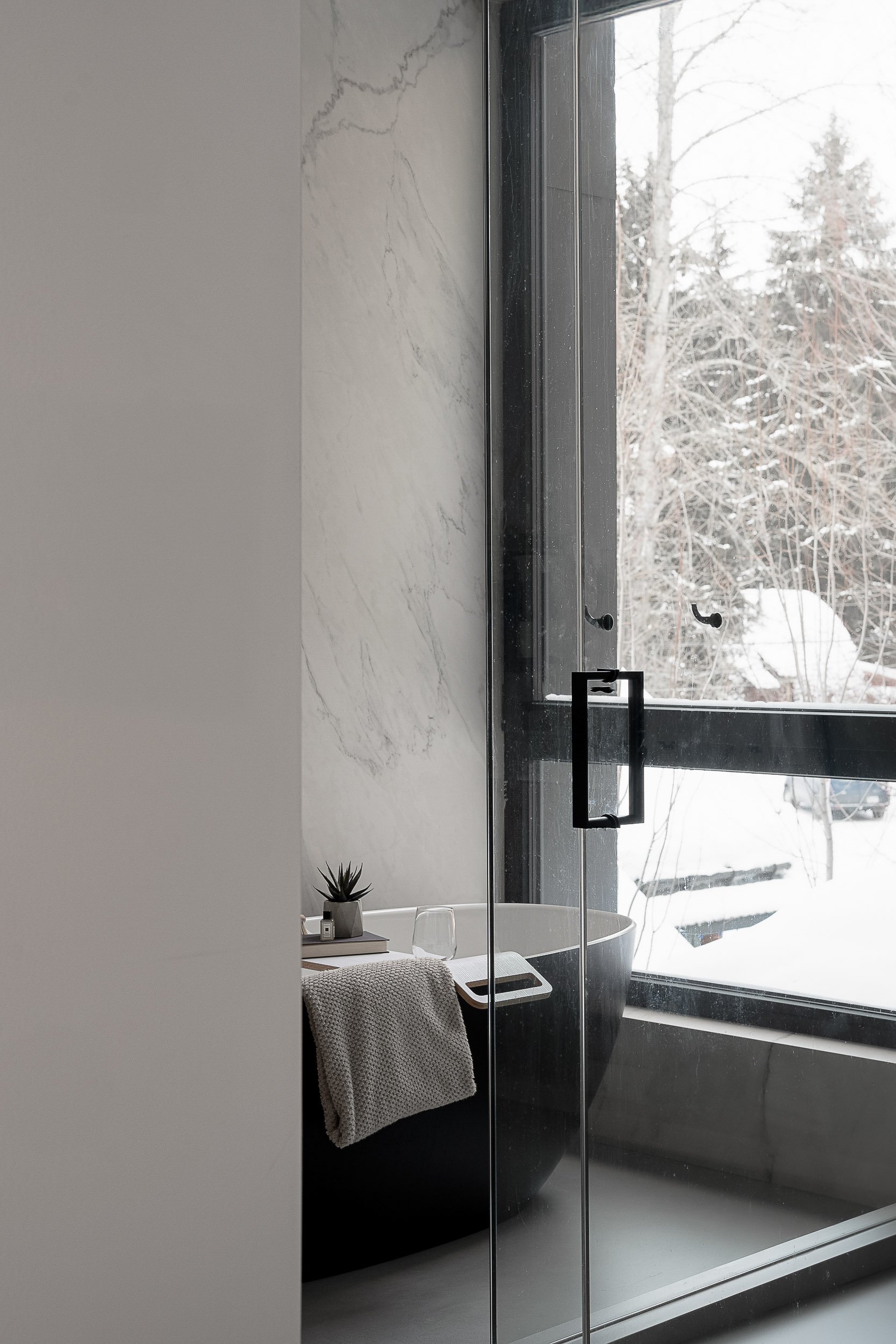
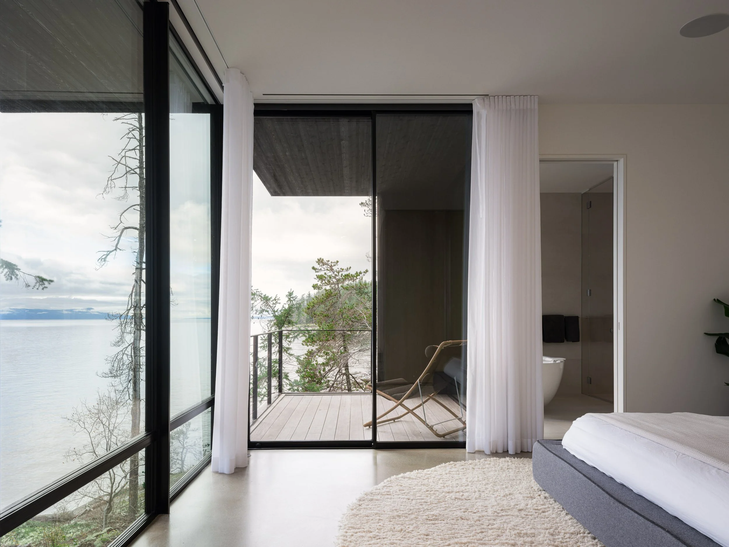
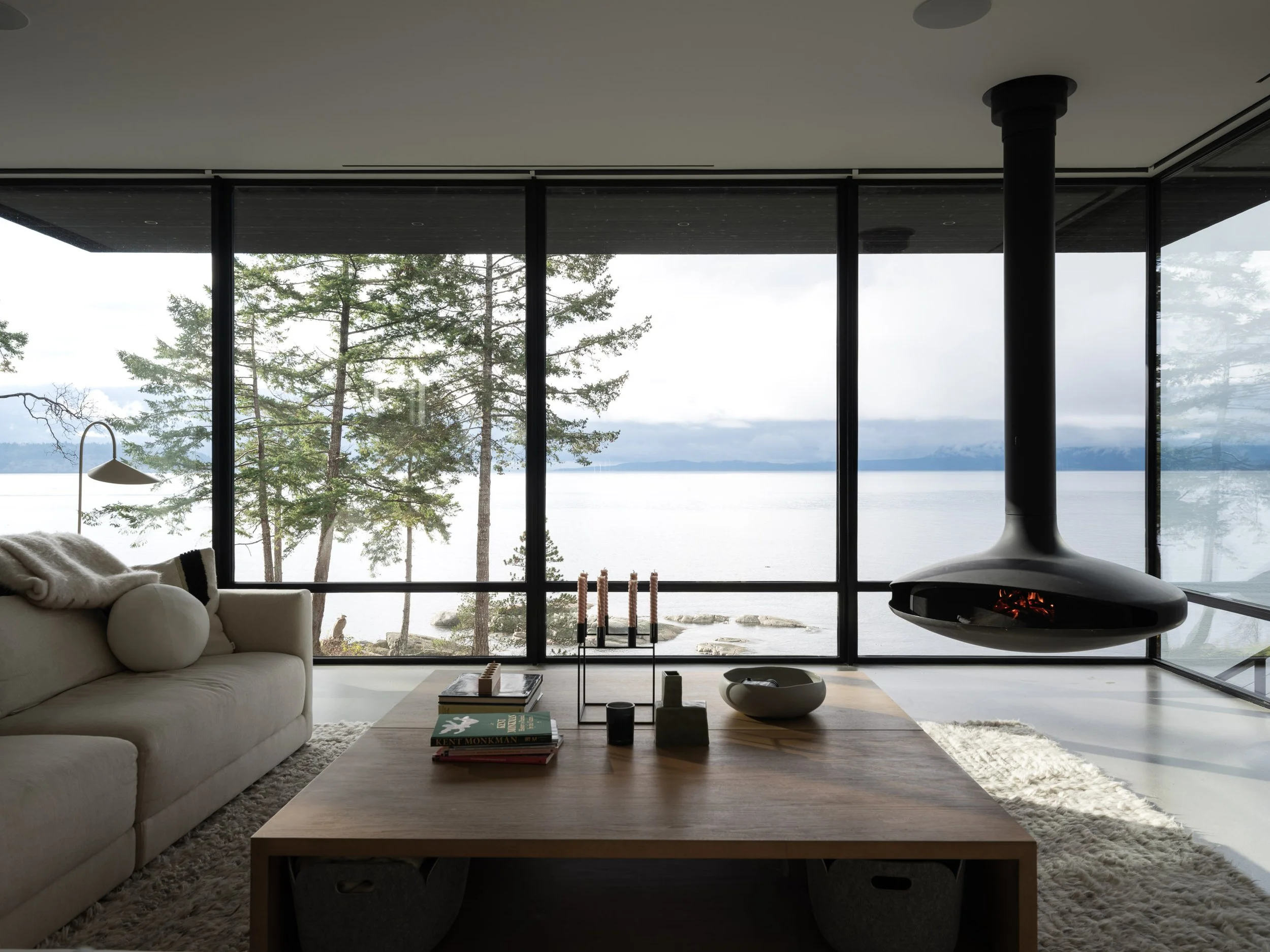
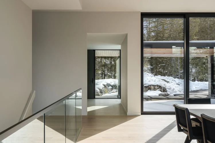
3. Window Exposure
The dynamic range between a bright exterior visible through a window and the darker interior of a room is the single greatest technical challenge in interior photography. Get it wrong, and you either have blown-out white rectangles where the windows should be, or an artificially flat image where everything glows uniformly.
Amateur approaches using automatic HDR create those flat, uniformly-glowing results that lack depth and atmosphere. Professional selective exposure blending maintains the natural fall-off of light through the space while preserving the view through the windows. This is particularly critical when the windows frame a project's primary design feature: a mountain view, an ocean panorama, or a carefully considered landscape.
4. Camera Height
Camera height determines how the viewer experiences the space. Positioning between 42 and 52 inches from the floor approximates standing eye level and creates a natural balance between floor and ceiling planes. This is the starting point, not a rule.
Design intent should dictate specific height choices. A composition emphasising horizontal flow through connected spaces may warrant a slightly lower angle that gives more presence to the floor plane. A room with a dramatic ceiling might benefit from a slightly higher position that gives the ceiling more visual weight.
The key is intentionality. Every centimetre of camera height changes what the image communicates about the space. Careless placement produces careless results.
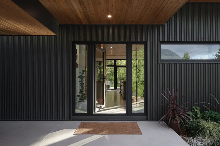
5. What's in the Frame That Shouldn't Be
Before pressing the shutter, the photographer must systematically scan the entire frame for distractions. Light switches in prominent positions. Electrical outlets. Thermostats. Fingerprints on stainless steel. Dust on horizontal surfaces. Reflections of the photographer or equipment in mirrors and glass. Cable runs visible along baseboards.
These details, invisible in person, become magnified in photographs. A thermostat on a beautifully finished wall. A power strip peeking from behind a kitchen island. A cleaning product bottle left on a countertop. Each one pulls the viewer's eye away from the design and toward the mundane.
Meticulous attention to what's in the frame means carrying cleaning supplies, requesting homeowners remove everyday items, and spending time before each composition scanning for anything that doesn't serve the image.
Why These Details Compound
Individually, each of these five fundamentals is minor. Collectively, they're the difference between images that feel right and images that feel off. Excellence across all five creates photographs where the viewer's attention goes exactly where it should: to the design, the materials, and the spatial quality of the project.
A deficiency in even one undermines the entire composition. Leaning verticals make the viewer uneasy. Mixed colour temperatures make the space feel chaotic. Blown windows remove context. Wrong camera height misrepresents the proportions. Distracting elements pull focus from the design.
The best architectural interior photography isn't noticed for its technique. It's noticed for how clearly it communicates the quality of the architecture. That invisibility is what these five details make possible.
Every detail in your project matters. The photography should prove it.
Let's create images with the same attention to detail you put into the build.
Book a Discovery CallNot ready to talk? Get Pricing